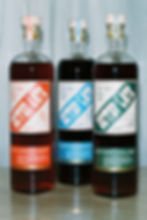
Zignum Mezcal
From the rugged mountains and vibrant cities nestled in their valley, to ancient temples and modern seaside escapes, Oaxaca is a place with a rich history and culture to discover. Oaxaca is home to Zignum.
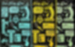
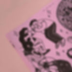
Zignum– meaning tip of the spear– has been outfitted in all new packaging inspired by pre-Hispanic Oaxacan temples. Silver and gold embossing pops from the label’s black paper stock, referencing the colors of the liquids and paying homage to the region’s heritage. The geometric patterns are derived from Zapotec weavings and symbols, flanking a doorway, leading to a dark entryway that calls to mind the cool, dark, barrel-aging room at the distillery. The wooden closures reference Zignum's unique barrel aging process and also honor the local tradition of hand-carved alebrijes.
Agency: Quaker City Mercantile
Creative Directors: Steve Grasse & Wade Keller
designer: mitch wiesen


Thanks for checking out my work.
let's make
something
great.