queens university
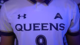
Queens was poised to transition from a D2 to D1 Athletics Institution and they needed a contemporary logo system laced with legacy to take them there (and to look good on ESPN).
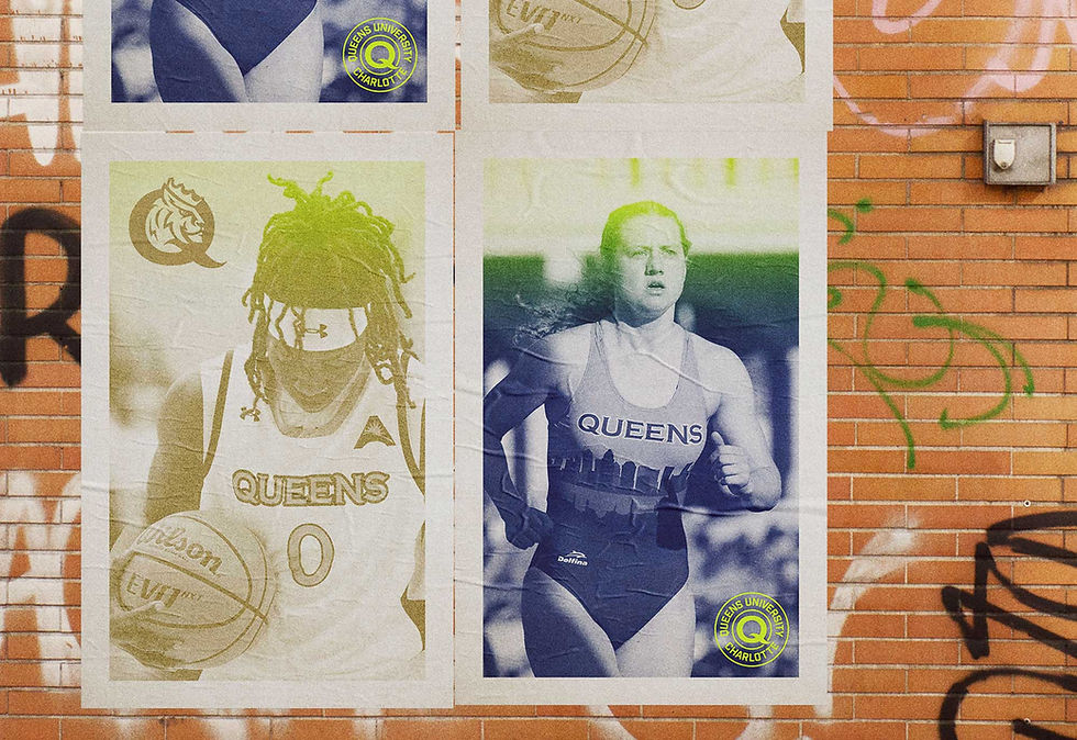
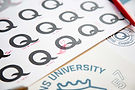
Inspired by the imperfect tails on Qs in old sign-painter catalogs, I crafted a custom letterform and two wordmarks that strike the right balance between historic and modern; exuding heraldry and legacy, without sacrificing any of its contemporary edge.
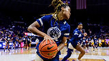
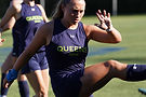
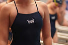
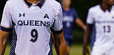
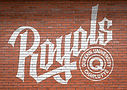
I built out that custom Q into the acronym QUC for use on their scoreboard, and into the word QUEENS, which has since been implemented as their primary institutional logo. I even designed them an energetic script wordmark for their team name Royals.
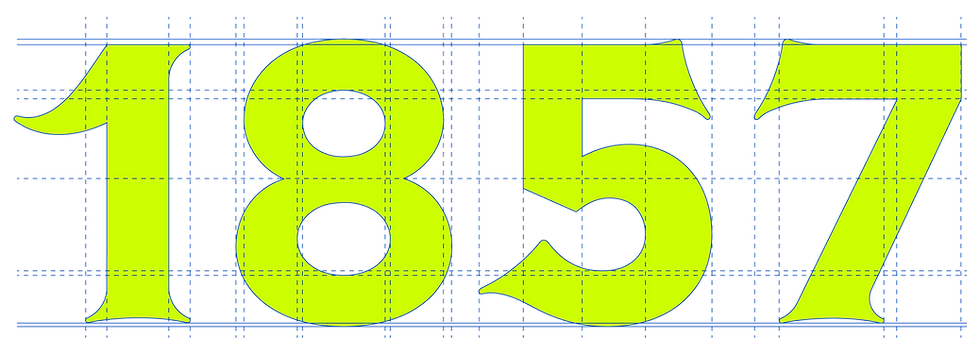
With the ability to fully customize their new uniforms and gear, I couldn't resist the opportunity to design Queens University a set of custom numerals. I built them out in three distinct styles, for future designers to really have fun with.
When all was said and done, they even let me design their new basketball court.
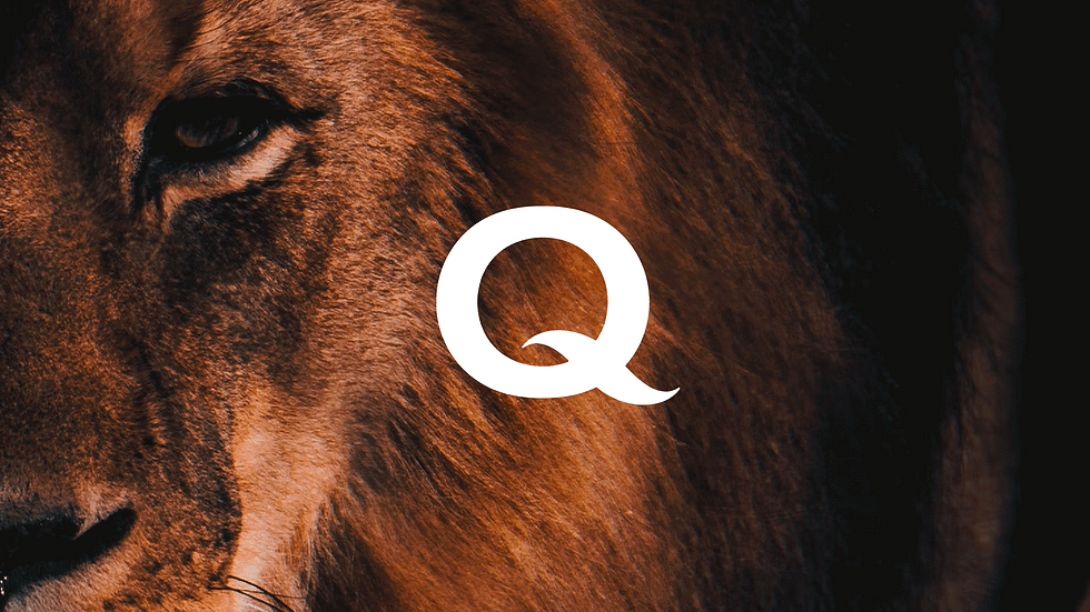
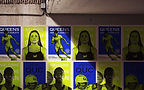
It was a Royally big undertaking, but we gave Queens a recognizable new identity system everyone could see themselves in (even Rex, their beloved lion mascot.)
Agency: Truth & Consequences
Creative Director: Stephen Penning
designer: mitch wiesen
Animator: Devon Burgoyne
photography: tom ammon, T&C Studios


Thanks for checking out my work.
let's make
something
great.