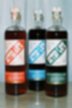
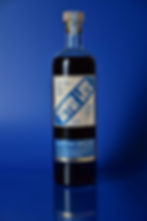
better late amaro
Better Late is a line of small batch amaro, designed to have a big impact. Made in Los Angeles using responsibly sourced botanicals, Better Late understands the value of taking things slow. This brand was deserving of a package design as authentic and casually cool as their amaro.
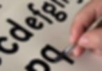
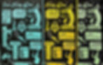
The logo type is a custom wordmark, which was built out into a boutique font, inspired by the ultra-heavy, ultra-condensed type found on vintage Italian packaging. The tagline, “Bei Tempi, Tempi Lenti” (good times, slow times,) is hand lettered in a long, scrawling script, and imbued with the feeling of having nowhere specific you need to be.
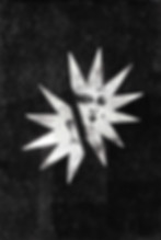
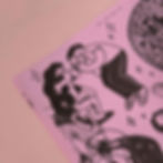
The illustrations on each of the bottles are inspired by the art of Italian gesticulation. These elements come together to capture the feeling of late nights chatting, eating, and drinking around a familiar table with family and friends.
designer: mitch wiesen
photographer: Cully Wright
photography director: Julie Goldstone


Thanks for checking out my work.
let's make
something
great.